


Many customers want to add more colors to cosmetic color-printed packaging boxes, but they find it very strange to match many colors. According to various understandings, consumers' intuitive feeling of objects is color, so the design must be mastered. color.
Today, let's talk about the complementarity between various colors and products.
")
Most people think that the emotional role of color is generated by people's associations, and associations are inseparable from people's age, gender, occupation, social environment, and life experience. Therefore, the color fixed pattern caused by people's habits for a long time also makes some color feelings become eternal in people's hearts.
1. Red is a very stimulating color, representing enthusiasm, vitality, and positivity, and also represents joy in China. The example of red is Wanglaoji herbal tea.
2. Orange gives a lively and lively impression. Products for teens in cosmetic color printed packaging boxes
3. Yellow has the symbolic meaning of light, hope, clarity and nobility. The impression of yellow is also stronger, so if the color printing packaging box of cosmetics is not printed in yellow, it can also be gilded to make consumers have an impression.
4. Green is the color of vegetation in nature, symbolizing nature and hope, as well as youth and life. Can be used for fresh style packaging.
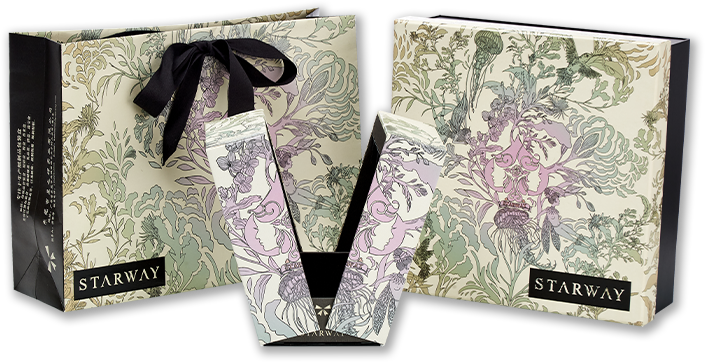
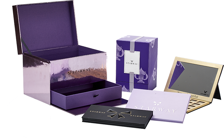
5. Purple, with a sense of nobility, mystery, and elegance, but also arrogance and negativity. It is mostly used in color printing packaging boxes for women's cosmetics.
6. Black is a kind of solemnity. The color of solemnity and darkness, negativity at the same time. is an indispensable color. Mostly used on men's boxes.
Mastering the meanings of these colors will make it easier to design.